Tux@lemmy.world to linuxmemes@lemmy.world · 2 years agoHow diffrent OSes evolvelemmy.worldimagemessage-square212linkfedilinkarrow-up1728arrow-down1114
arrow-up1614arrow-down1imageHow diffrent OSes evolvelemmy.worldTux@lemmy.world to linuxmemes@lemmy.world · 2 years agomessage-square212linkfedilink
minus-squareCethin@lemmy.ziplinkfedilinkEnglisharrow-up4·2 years agoFor the Mac and Linux graphs the color seems to represent the rate. When it’s going up it’s green and when it’s going down it’s red.


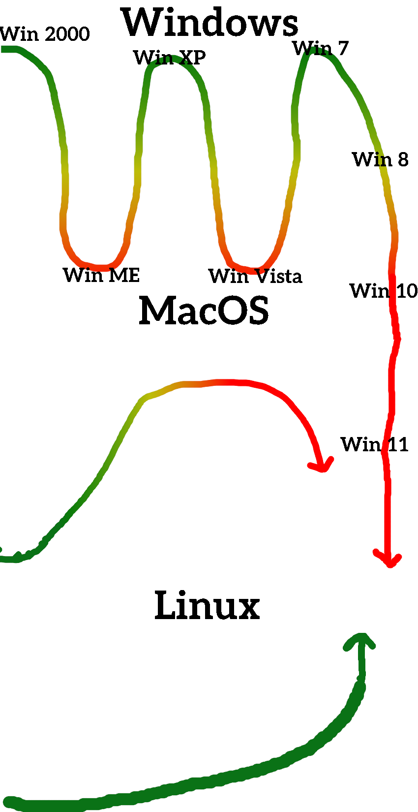
For the Mac and Linux graphs the color seems to represent the rate. When it’s going up it’s green and when it’s going down it’s red.
Yeah, but that’s just inconsistent…