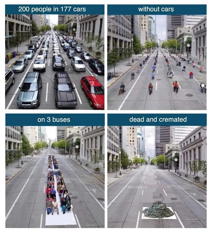
They “fit” as in the average number of occupants in cars is only 1.13 person. However this illustration still doesn’t take in to account that these 200 people can’t take the same few busses because they’re likely not going from or to the same places. So the number of busses really should be significantly higher than shown.
I don’t know, but if you think about it a bus only needs to carry like 3 people to be more space efficient than a typical car. Most busses probably carry more at least during peak hours based off of numbers from my butt.


They “fit” as in the average number of occupants in cars is only 1.13 person. However this illustration still doesn’t take in to account that these 200 people can’t take the same few busses because they’re likely not going from or to the same places. So the number of busses really should be significantly higher than shown.
True, but nowhere near high enough to invalidate the actual point
This also doesnt take into account that people would enter the bus even if there arent any seats remaining
And what is the average number of occupants in a bus? (genuine question)
Interesting dynamic is that I think bus occupancy tends to scales up with demand, i.e. at rush hour. Car occupancy less so (i think).
I don’t know the answer - but I expect occupancy at peak travel times is of most interest.
I don’t really think averages are that useful though, the whole system context is important. These diagrams are just stupid memes.
I don’t know, but if you think about it a bus only needs to carry like 3 people to be more space efficient than a typical car. Most busses probably carry more at least during peak hours based off of numbers from my butt.