

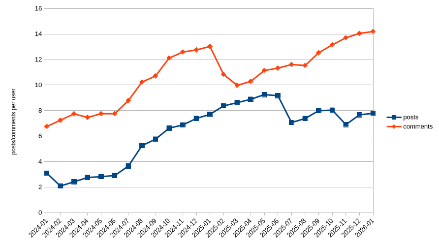
Following https://tarte.nuage-libre.fr/c/fediverse/p/194717/we-need-more-users I decided to explore data a little bit more. I’m not the biggest fan of growth-as-as-target so I wanted to see how much the people were participating in the discussion.
The data
I took the data from the API explorer in https://api.fediverse.observer/ with this query:
query {
  monthlystats {
    date_checked
    softwarename
    total_posts
    total_users
    total_comments
  }
}
Then parsed the json with this https://jqlang.org/ filter:
jq '.data.monthlystats | map(select(.total_users > 0 and (.softwarename == "lemmy" or .softwarename == "mbin" or .softwarename == "kbin" or .softwarename == "piefed"))) | group_by(.date_checked) | map( {date_checked: .[0].date_checked, total_users: ([.[] | .total_users] | add), total_posts: ([.[] | .total_posts] | add), total_comments: ([.[] | .total_comments] | add)}) | map({date_checked, posts: .total_posts/.total_users, comments: .total_comments/.total_users}) | sort_by(.date_checked) | map([.date_checked, (.posts | tostring), (.comments | tostring)]) | .[] | @csv'
(As you see I filtered for the threadiverse. I also did the same with all software, I’ll put the graph for that in comments)
Then did a good old’ chart
What to think of it
I don’t know. Users’ activity is on the rise and I find it nice
One thing that annoys me about each statistic about posts is that I don’t know how many of these posts are actually interesting and engaged with.
For example, there is a specific instance that just mirrors reddit content and has barely any engagement. The bot posts mulitple posts per hour, mostly without any comments or upvotes.
It seems rather irrelevant to compare these posts to actually interesting posts with a nice discussion and a couple of upvotes.
My suggestion would be to count and plot the number of posts that have at least a few interactions.
Out of curiosity, which instance?
The instance is called lemmit.online, and the most upvoted post on the whole instance is “This bot is bad for lemmy”.
the question is whether the upvotes of that post makes over half of the total upvotes on all posts on that instance, and that i seriously doubt
No? Did I claim this?
The most upvoted post has ~20 upvotes, but there are a lot of posts with 1-5 upvotes.
PieFed labels bots and bot-like accounts, allowing you to choose options like blur or show the content semi-transparently.
I‘m not worried about myself. It’s easy enough to block stuff I don’t like. All I wanted to say is that counting daily posts without excluding bots doesn’t make much sense to me.
The issue does get murky - especially when people use the same account both for their bot posting and also for their human interactions, rather than separating the two.